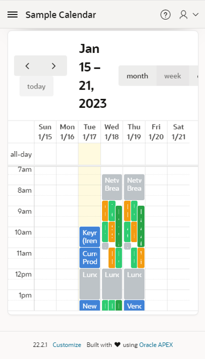
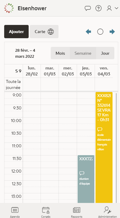
Even with the last version of Oracle APEX (22.2) which embeds Version 5 of FullCalendar, displaying can be slighty improved to give a better rendering on mobile devices.
Below are two samples emulated on iphone 6: First one is a displaying with default values, Second is a a calendar with some additional actions.


Additional actions
In the improved version, we:
- Hide navigation option in Calendar Views and Navigation section
The standard arrows will be replaced by customized buttons
- Add three buttons in EDIT section of the Calendar region
- Previous
- DA on button:
apex.region("calendar").widget().data("fullCalendar").prev(); - ico: fa-arrow-left-alt u-color-1-text
- DA on button:
- Today
- DA on button:
apex.region("calendar").widget().data("fullCalendar").today(); - icon: fa-pie-chart-0
- DA on button:
- Next
- DA on Button:
apex.region("calendar").widget().data("fullCalendar").next(); - icon: fa-arrow-right-alt u-color-1-text
- DA on Button:
- Previous
- override class style at the page level in INLINE CSS section
.fc .fc-toolbar-title {
font-size: small;
}
